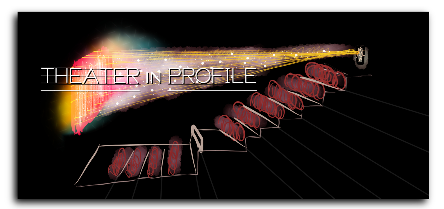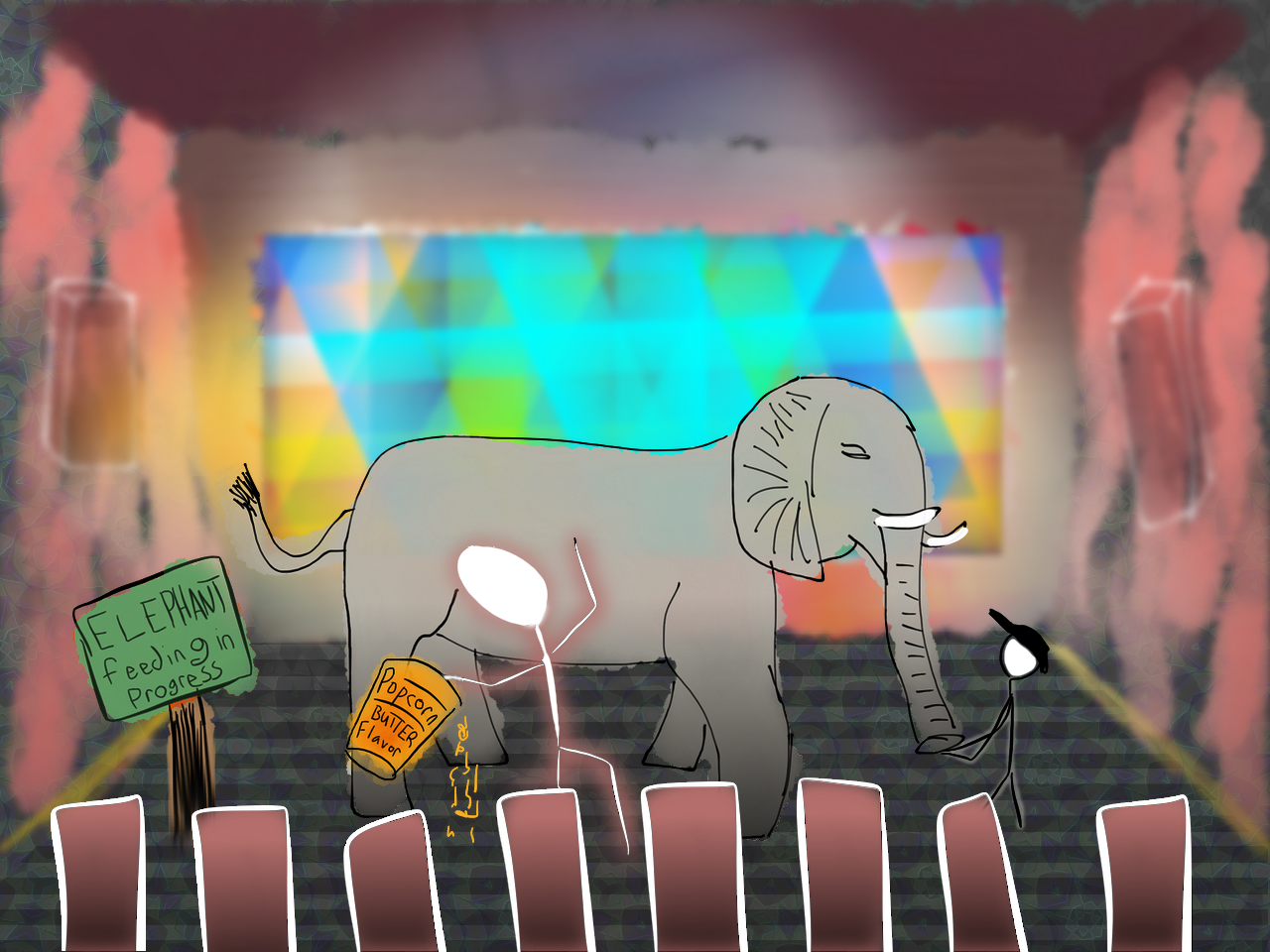
I made this image for a post on Serial Innovation about redesigning movie theaters. I needed a visualization of a theatre from the side, so I sketched something quickly and then spent way longer trying to make it look snazzy.

This was a piece of volunteer work for an incredibly worthy cause. The Flying Doctors provide care in some of the most remote communities—but they also operate right here in America. It's been my experience that many non-profit organizations are focused so completely on doing good work that they aren't always cognizant of how design can amplify their message. This infographic was my small contribution to that effort. Their work is professional; their look should be, too.

This was one of the banners I designed for my site, Serial Innovation. The banner designs are based on the concept of the logo—which extends the parallels of the lowercase L in "serial" and the uppercase i in "innovation." For the banners, I thought that every image should have something beneath or behind it, mirroring the logo. This image is for the article on NYC's soda ban. The arm raising the drink is taken from the real-life messaging that appeared on trucks in NYC at the time. Golden colors are meant to evoke the same premium palette that soda brands often employ.

To illustrate a long article on Twitter, I made a trip to a local zoo where I could photograph birds. This is my favorite from the piece—heading up the section on advertisements. I've processed the whole image into a soft, painted-on glass feel: a fun trick of layering. I just love how an otherwise standard photograph can be brought to life with creative editing. The parrot looks like it's entranced by its own advertisements—just like so many social networks.

I just love the idea of statues melting on the streets; of dirty water running from faucets; of whole municipal gardens wilting away—I love guerrilla marketing campaign getting under the skin of a city. Just think of what you could do if you had a campaign against soda in New York City. For this design, I wanted to show the sheer abundance of possibilities. I also wanted to share some rather disturbing statistics about soda consumption. The design takes inspiration from Coca-Cola; the sketches of the ideas are my own, lending a sense of fun to the somewhat macabre material. This piece appears alongside the Serial Innovation series of articles on Obesity and Soda. Check it out at Serialinnovation.org

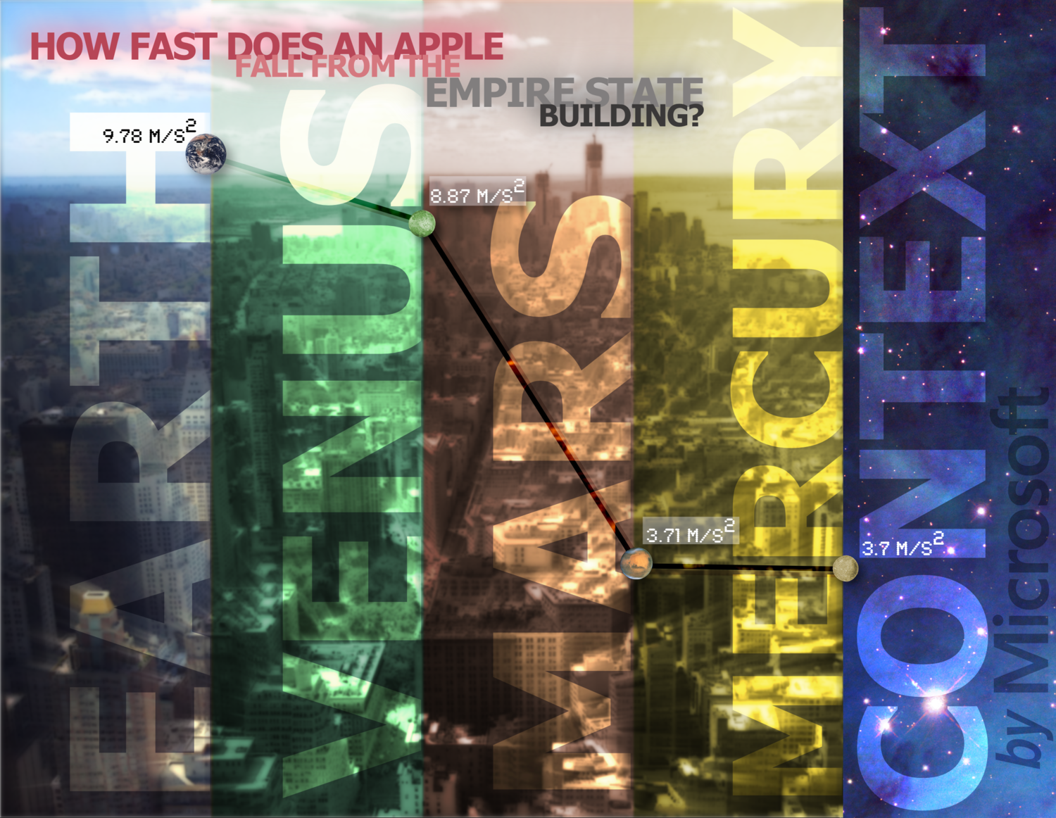
What if Microsoft wanted to advertise a compelling new feature? That's what I tried to imagine with this piece—which is somewhat busy now that I see it again. The idea, however, was clear: illustrate how an intelligent computer might fill in context around given data. You give it one piece of information—how fast an Apple falls from the Empire State Building—and it builds a graph of similar speeds based on the gravity of other planets. Each planet gets its own name and its own representative color. The product, too, gets a name—but it's background and capabilities are now cosmic. In retrospect, I should have faded the skyline of NYC in the background—perhaps eliminating it in favor of a more basic illustration. And I should have made the lines connecting the points (planets) brighter and easier to follow. Oh well.

How do you illustrate a new take on the old word processor? This image is yet another imaginary advertisement by Microsoft—advertising a proposed piece of software. First, I found a background photo in my archive that could serve the right purpose. This one's of a cathedral in Edinburgh, Scotland, spotted from the window of our bus as it sped through the city. It took a bit of sleuthing to figure out just what cathedral it was that I saw years before. Once found, it served as the basis for the sample paper that I wrote on the left—and the facts displayed on the right. I really like how this turned out. The colors, of course, are all stolen from Microsoft's pallet. I had fun imagining what the logo for this service would be—and basing it on the idea of highlighting seemed just right. The text doesn't have to be immediately legible, I think, as long as the idea it represents is.

It’s right about here that I’m noticing just how often animals show up in my designs and illustrations. Why is that, you may ask? I’m not sure. I suppose that animals provide a fun contrast to problems we face; and by casting animals in the role of people, we can understand just how ridiculous some of our postures are. Whether it’s advertising our qualities, finding food, or obstructing the view in a movie theater. For this image, I knew that I wanted to talk about the ways that elephants and pandas eat—so I needed pictures. Stock photos work in a constrained corporate environment, but I never want to use stock on my website—so for Serial Innovation I took a trip to the National Zoo. It took a while, but after a few hours I was lucky to get this incredible view high above an Asian elephant chomping away.

Here was another trip to the zoo inspired by the need for original imagery in a story at Serial Innovation.org. I was lucky to take this picture of a panda through glass at the National Zoo in Washington, DC. But even though I had a nice camera, the image was pretty low quality. Maybe that's a problem in photography—but it's an asset in design! I went with a grungier look. The background was a wall of bamboo found elsewhere in the park. Often, when people consider design, they think of good photography or good illustrations—but interesting textures and backgrounds are just as important. I always have my eye on the lookout for them...16 hours a day.

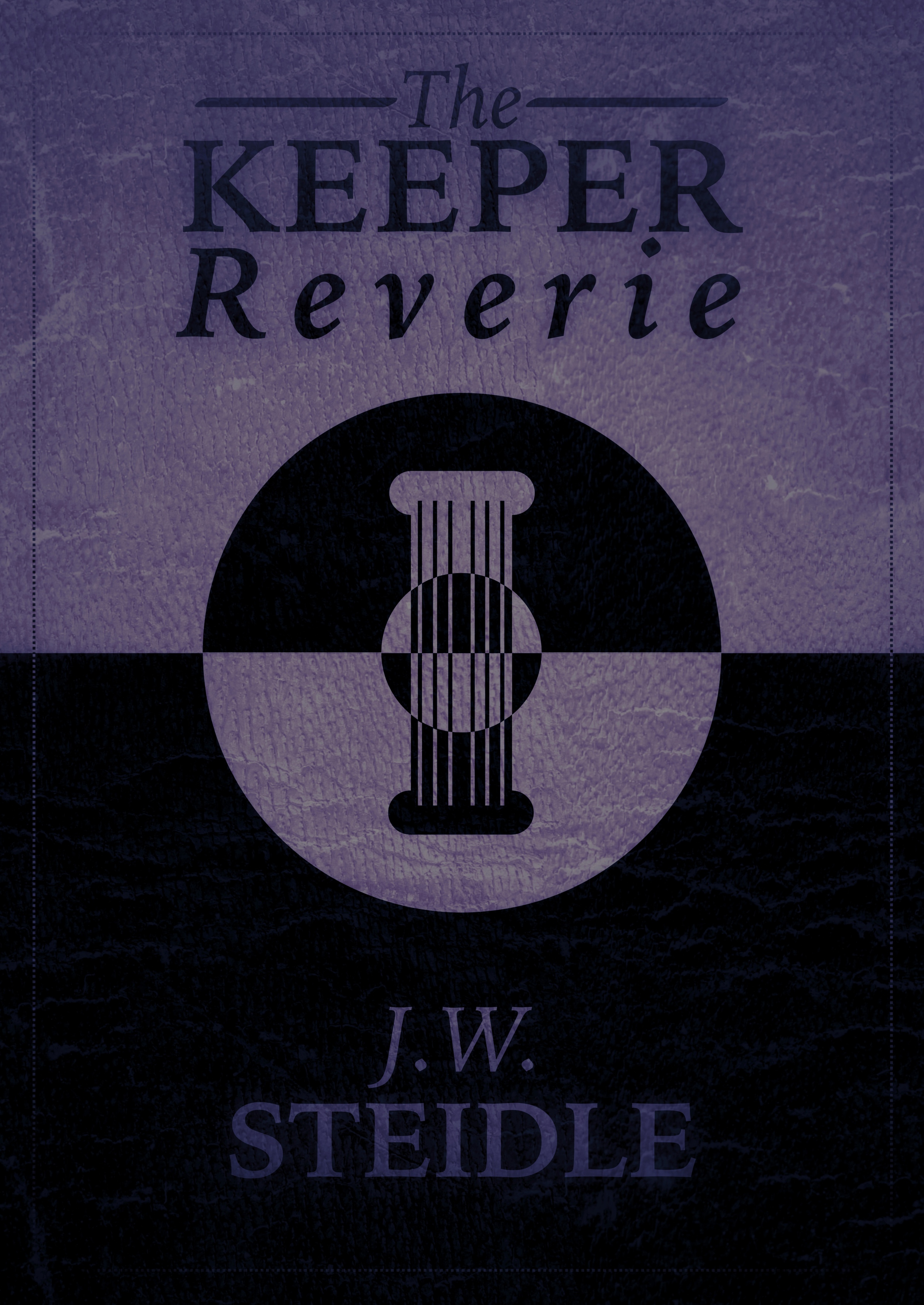
My personal favorite of the cover options. It feels like a worn leather cover. Or textured paper.

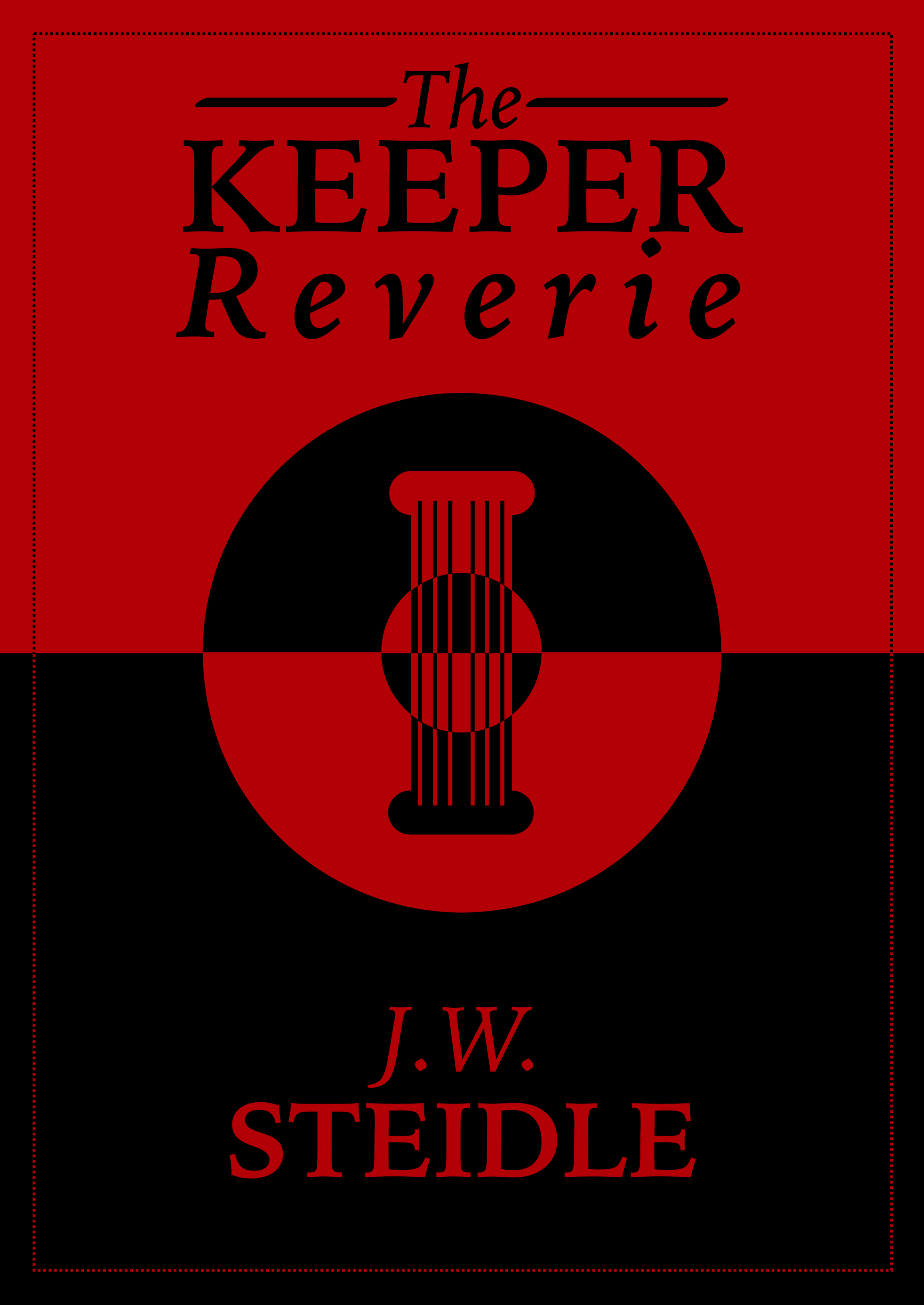
This is the cover of the novel I designed for my brother Jamie's book, The Keeper Reverie. His only direction: something with a pillar or column. I played on the theme of light and dark—and the idea that the closer you get to the center, the more often these forces tend to change. I liked the versions you see here—with some texture and color; but Jamie preferred the sharpness of stark white and black. You can see the final version at Amazon.

Jamie liked this red version but I talked him out of it. It seems too heavy to me—but maybe if it were printed on glossy paper and if the red was tuned down closer to a fire-engine red, it would work.

Great content isn't just great ideas; it's great design. Great imagery. For most blogs and commentary, a photograph will suffice. But how do you illustrate a new idea? That's the problem that I ran into again and again with Serial Innovation. Here's one solution: half stick figure, half cartoon—with a bit of gaussian blur for depth and color. It's a fun amalgamation that serves more as a joke than a serious proposal, but it was just as fun to produce. I still don't think I have the right solution for illustrating new ideas, so I keep trying new approaches. In the meantime, it's worth having a sense of humor.

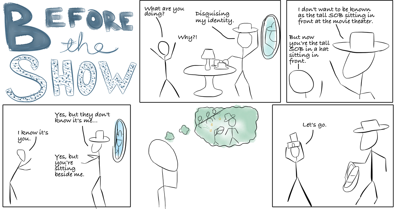
This is the first and as of now the only comic I've ever done. Comics are a lot harder than they appear. As a comics fan, my interests span two polar opposites: Bill Watterson's lushly-illustrated artwork in Calvin and Hobbes on one end, and Randall Munroe's stick figure—and often single-panel—pieces on the other. With just a simple concept, it's obvious I chose the easier route: but there were still a million decisions to make. From a writer's perspective, I heard the dialogue immediately in my head—but in a comic there are so many other considerations. How do you differentiate the characters? What are the characters doing in each panel? How many panels—and how big is each panel? One thing that I always found curious about comics was the issue of synchronization. Often, a character will say two or three things in each panel—and yet each panel only shows us one snapshot in time. So how does that snapshot align with the character's voice? Is it an image before they spoke, or after? All of these issues are comfortably abstract until you try making your own. It's a challenge everyone with an appreciation for the medium should attempt at least once. Not only is it fun—but if you use it to illustrate an idea, I think your content will just leap off the page. Everyone likes a comic.

Having spent so many years in Washington, DC, it's been fun to watch hyper-local politics here in California. This was designed for a colleague running to retain her seat on the Board of Education. The original invitation had been mocked up in Word by a campaign volunteer and featured prominent photos of the two candidates. Well, I was a volunteer, too—but I was asked to take another shot at it. My first goal: eliminate the photos. Unless a photo is the subject of the design—wall to wall—or a teeny-tiny icon, I think simple shapes, colors, and fonts can achieve more. The color scheme here was adapted from the logo of Perez's campaign—a really nice palette. So much of campaigning is a whirl—a blur of throwaway moments and glances. If I could contribute anything, I wanted it to be solid and bright. I wanted this to feel like a ticket to somewhere special. Elizabeth Romero won her election.

Health insurance enrollment in California was historic in 2014. I was privileged to work with a great team of non-profits helping to spread the word and get people the care they needed. As the enrollment period came to a close, we decided to hold an event—not only to celebrate success, but confront leadership with the challenges that still existed. For the flyer design, I played with the very pliable California Flag, which features a bear crossing a pasture of green. Well, let's give that bear a doctor's lab coat and a stethoscope and— Wait! It looks like the bear's listening to the latest Beyonce album! Add some black to that stethoscope...there you go. Now it looks like a stethescope. I later adapted the look of the flyer for a PowerPoint presentation, certificates of recognition and an infographic that all accompanied the event. But since it was a bilingual team and audience, these materials had to be bilingual, too. I was lucky to work with an incredible translator (Antonio Alcantar). I very quickly learned just how tricky it can be to fit other languages into your English-first designs. So many fonts and sizes had to change. Text had to be re-alligned, boxes retouched. The only thing that didn't have to change: the bear. As it turns out, California's bear is multilingual.

This is the infographic that accompanied the event celebrating the completion of the first health insurance open-enrollment period in California. The message: yes, we achieved incredible things, but there was still much to improve. This served as an extension of the color scheme used in the flyer. For the day of the event, we printed these out as large signs on easels and also distributed hand-held versions to every guest (double-sided, English/Spanish). Since this project was my first extended introduction to California's flag, every time I see the flag flying my heart leaps: "Hey! I designed that!" And then I have to remind myself: Nope. Nope. Nope. No I did not. I simply remixed it.
